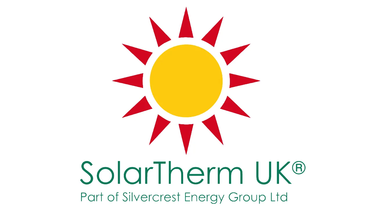
Every brand has a story, but some stories start with a single powerful symbol. For SolarTherm UK, that symbol is our iconic sun logo – a bright, bold emblem that captures not only what we do, but why we do it.
Today, we’re pulling back the curtain to share the inspiration, meaning and evolution behind the visual identity that has become synonymous with SolarTherm UK.
Where the Idea Started
Long before the first sketches hit the page, we asked ourselves a fundamental question:
“What symbol represents clean energy, sustainability, the promise of a brighter future and more importantly – what symbol represents us?”
And the answer was obvious – staring straight back at us from the sky – the sun!
As a renewable energy company, the sun isn’t just a source of power; it’s central to our mission. It fuels our technology, guides our products and inspires our commitment to helping homeowners save money while reducing carbon footprints. A sun logo was more than fitting – it was essential.
Bringing the Vision to Life
With the concept in mind, we moved into design mode. Our brand colours – deep green, red and yellow – played a massive role in the creative design process.
- Yellow represents clean, abundant energy and the optimism of renewable technology.
- Red conveys strength, passion and the heat associated with solar power.
- Deep green ties everything together with themes of sustainability and environmental responsibility.
The design team experimented with many styles, subtle rays, abstract shapes, geometric forms, even minimalist silhouettes. Eventually, one design stood out – the sun, with bold red rays and a radiant yellow centre, overlaid with clean text. It was dynamic, memorable and most importantly, it was SolarTherm UK.
Why This Logo Works So Well
Our sun logo does more than look good, it communicates who we are at a glance.
- It’s instantly recognisable – the bright colour palette and circular sun shape make it easy to spot in any context – whether on our website, uniforms, vans or marketing materials.
- It reflects our values – the combination of red, yellow and green tells the story of renewable energy, environmental care and long term sustainability.
- It represents the energy we deliver – sunlight is powerful, steady and free. Our logo reminds customers that solar energy can transform the way they power their home.
More Than a Logo – It’s Our Promise
At SolarTherm UK, our sun icon represents far more than a brand mark. It’s a promise:
- A promise of renewable, reliable energy
- A promise of reduced bills and increased home efficiency
- A promise of a cleaner, greener future
- A promise of honesty, trustworthiness and expertise
Every time you see our logo, we hope you’re reminded of the brighter tomorrow we’re working hard to create.
Ready to Start Your Solar Journey?
Contact SolarTherm UK today, for a free, no obligation quote and design, tailored to your property, usage and future energy needs. No hard sell, just honest, expert advice.
Your home. Your energy. Your future.


